Graphic Design II Course
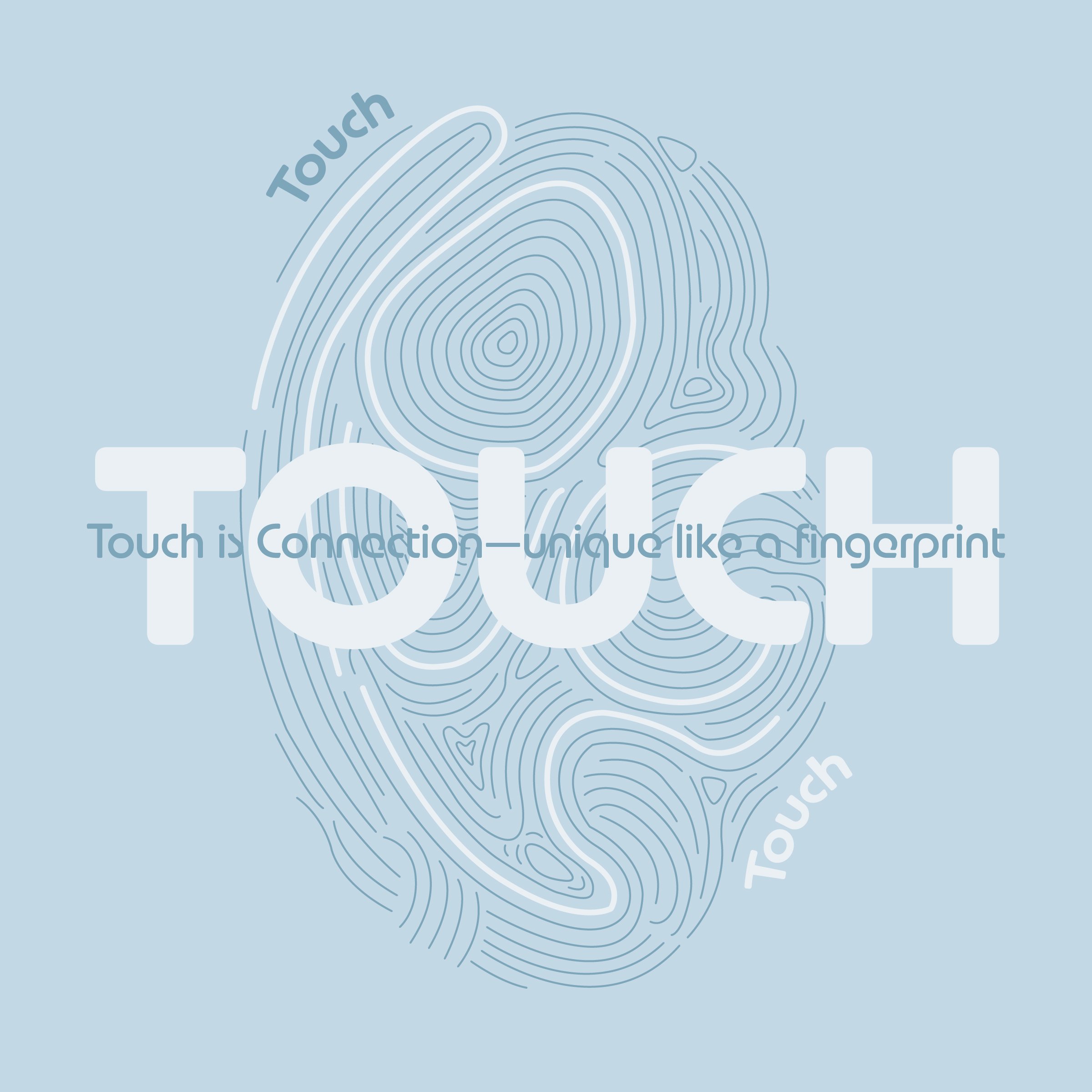
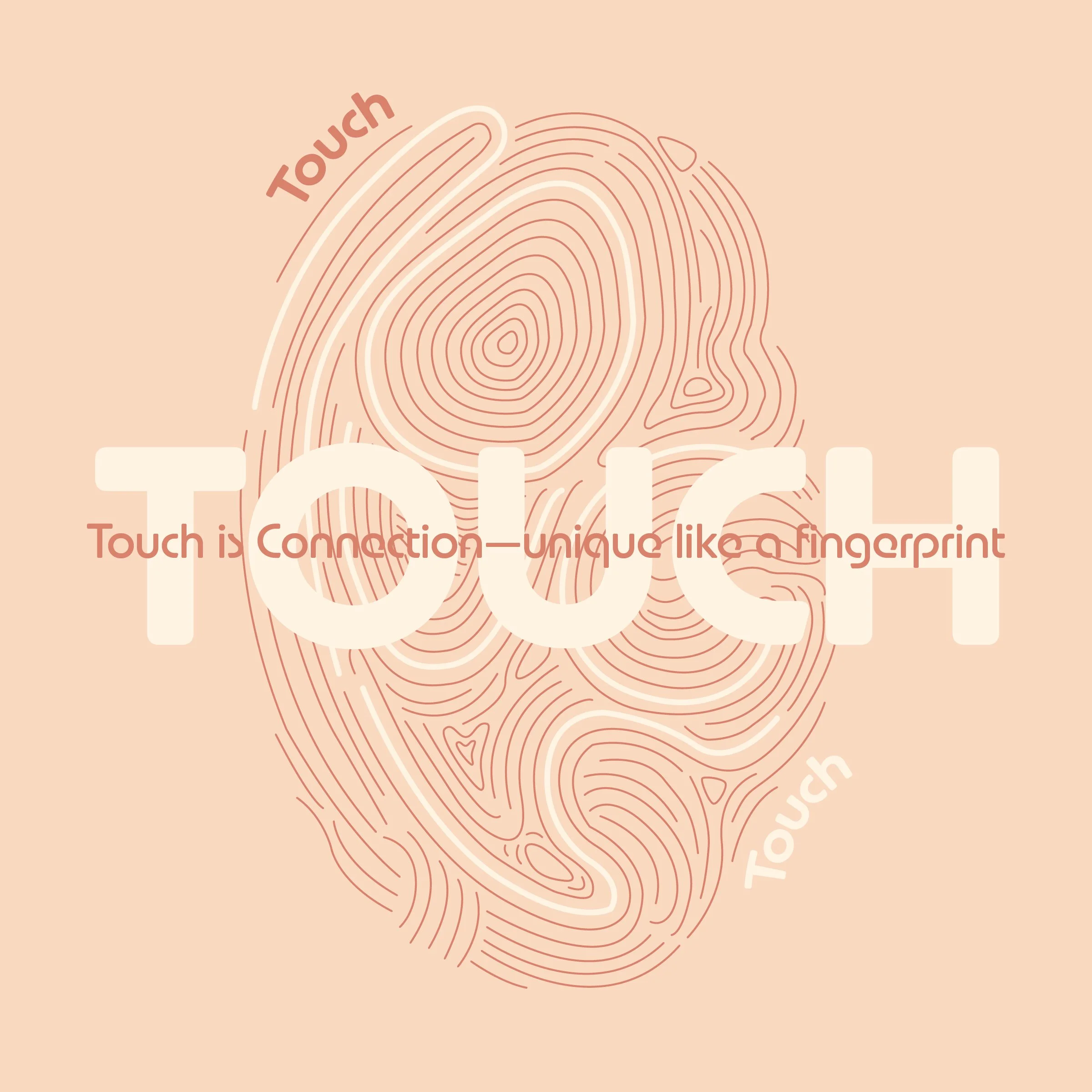
For my project, I chose the word “touch.” My design focuses on the idea that touch represents connection—something personal and unique to each individual, like a fingerprint. I used soft colors and rounded typography to reflect warmth and closeness, emphasizing the emotional and human side of the word.
Font used: New Astro Soft
Services
Social Media Design
Content Layout
